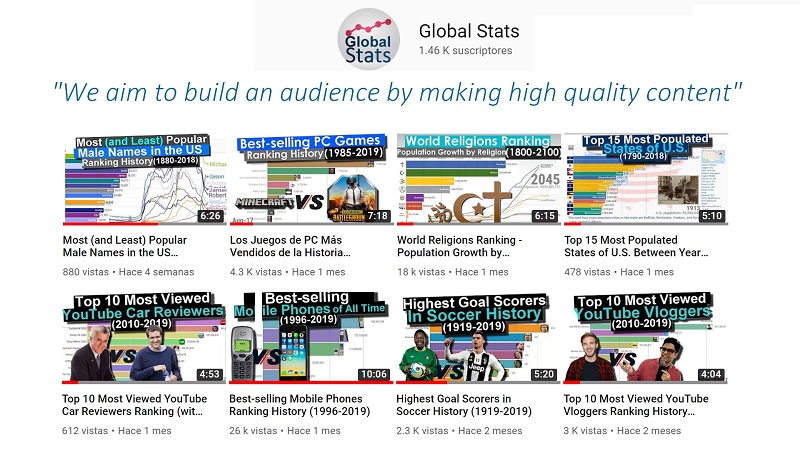
Welcome to GlobalStats. Our aim is to turn a wide variety of data, statistics and information into interesting, high quality videos and images, adding value, motion and an artistic dimension.
The Art of Data Visualization
Technically speaking, data visualization encompasses all things data art, infographics, and data dashboards. The range of creativity truly is endless. Data visualization experts and artists are creating amazing things in the world of data design every single day.
Making the visualizations
To create these visualizations, we follow a process that tipically takes 1 week for each video, and a multidisciplinary team, (designers, data engineers and visual artists).
1. Idea
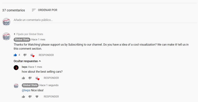
We first look for what kind data could be interesting to represent, using hot topics and trends as well. Also, we involve our audience by asking them what visualizations they would like to see.
2. Data Research
Each visualization requires a profound research to recolect and organize the data from papers, world data Banks, and a variety of publications and database resources.
3. Creating the Excel Sheet
After gathering all the information, we proceed to create a dynamic table on Excel, creating the input file for the next step
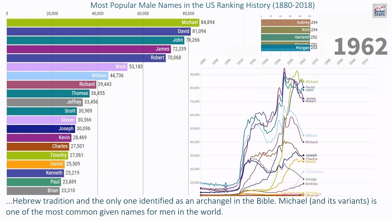
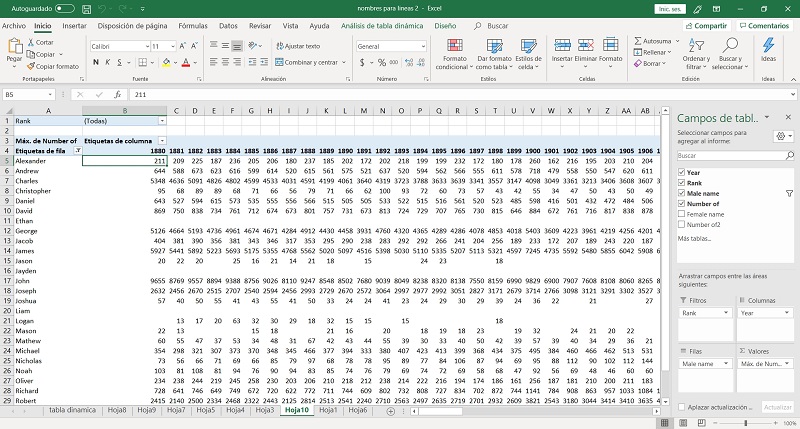
Excel Sheet for “Most (And Least) Popular Male Names in US Ranking History (1880-2018)” Video
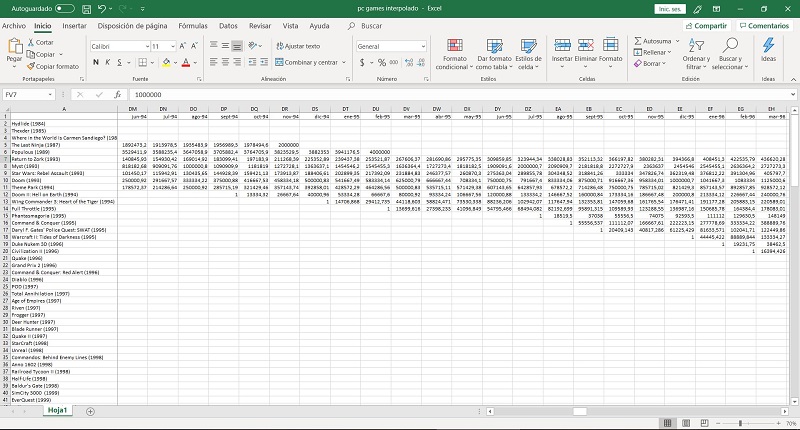
Excel Sheet for “Best-Selling PC Games (1985-2019)” Video
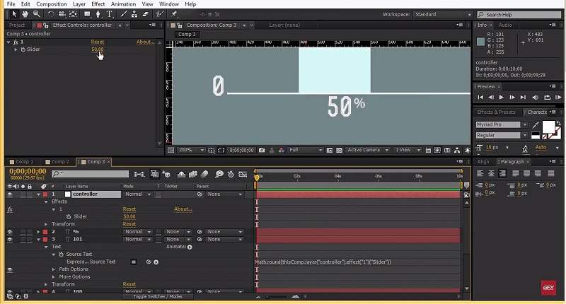
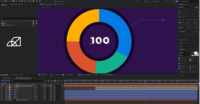
4. Creating the Animated Chart
Once the Excel Sheet its created, we use a variety of visualization tools to make the animations: Flourish, Power Bi, Excel 3d Maps, Adobe After effects.
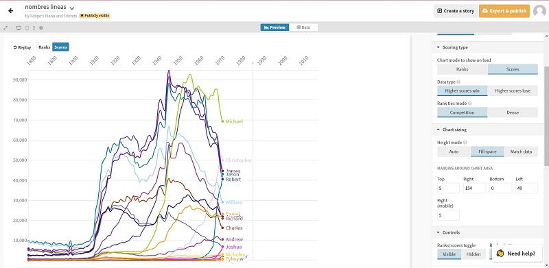
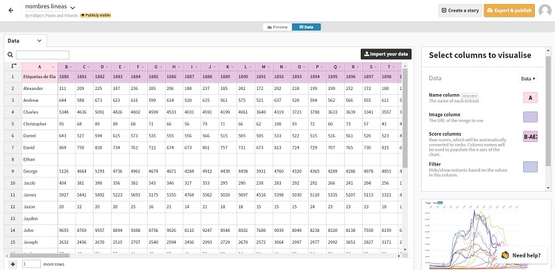
Line Chart Graph Preview for “Most (And Least) Popular Male Names in US Ranking History (1880-2018)” Video
Line Chart Graph Data
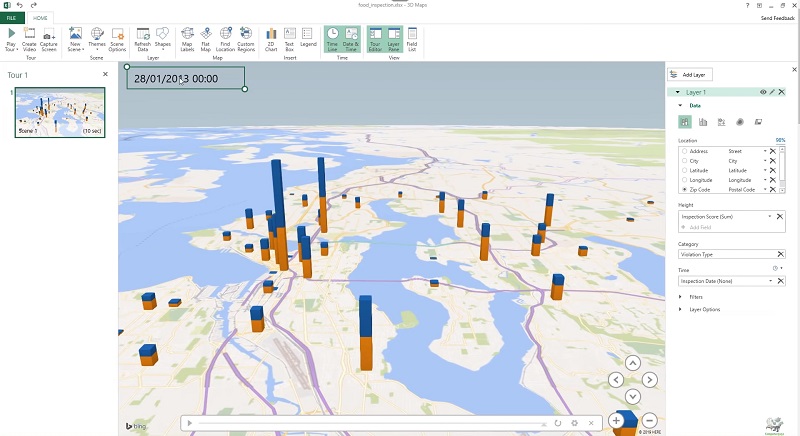
Excel 3d maps for an upcoming project
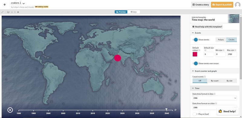
Map preview for “World’s biggest craters” Video
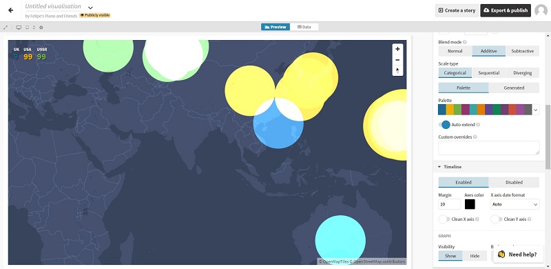
Map preview for “Every Nuclear Bomb Explosion in World History” Video
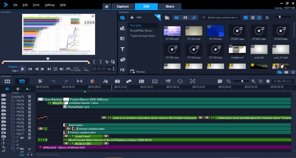
5. Creating the video and post procesing
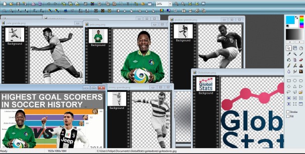
Once the animation its exported to video, we edit the final video using Corel VideoStudio Pro, adding images ( edited previusly with Adobe Photoshop), informative text,multiple layers, final animation and additional effects.
Adding Layers, texts, images, and animations on Adobe Premiere Pro